More than Just Text
In the world of design, we often come across the adage: "Less is more." While the simplicity of design is undeniably a virtue, the reality is that we can't always stick to just text, especially when it comes to digital platforms. This is where the challenges begin.
The Need for More than Just Text in Design
Pure text can be overwhelming. Think of an academic paper or a legal document; they are often difficult to navigate and can be a chore to read. If your design consists solely of text, you risk losing your audience's attention, regardless of how valuable your content might be.
The Temptation to Overwhelm with Design Elements
In an attempt to break the monotony, there's a tendency to go to the other extreme by adding images, graphics, shapes, lines, colors, and more. However, without proper structure, these elements can make your design cluttered and even more difficult to navigate than a text-only layout.
Embracing Visual Hierarchy
This is where visual hierarchy comes into play. It helps in structuring, controlling, and guiding the user through the information presented. With visual hierarchy, you can create a flow, emphasizing what's important while subtly moving the user's eyes through different sections of your content.
Look into below example
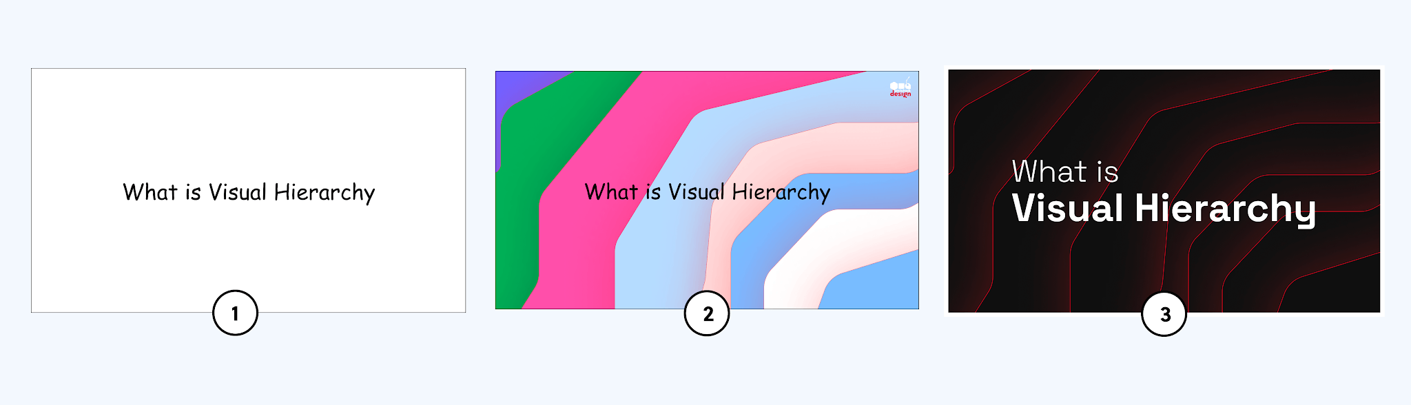
Image 1 is just text on a white background. But Images 2 & 3 have some cool design elements added around the title. Fortunate outcome is 98% of folks picked Image 3 'cause it just looks slicker and way more eye-catching. And yeah, it's crafted with some subtle design principles that really amp up the Visual Hierarchy. It's all about making certain elements stand out so that they grab the viewer's focus. This can be done using various techniques, some of which are detailed below.
1. Contrasts
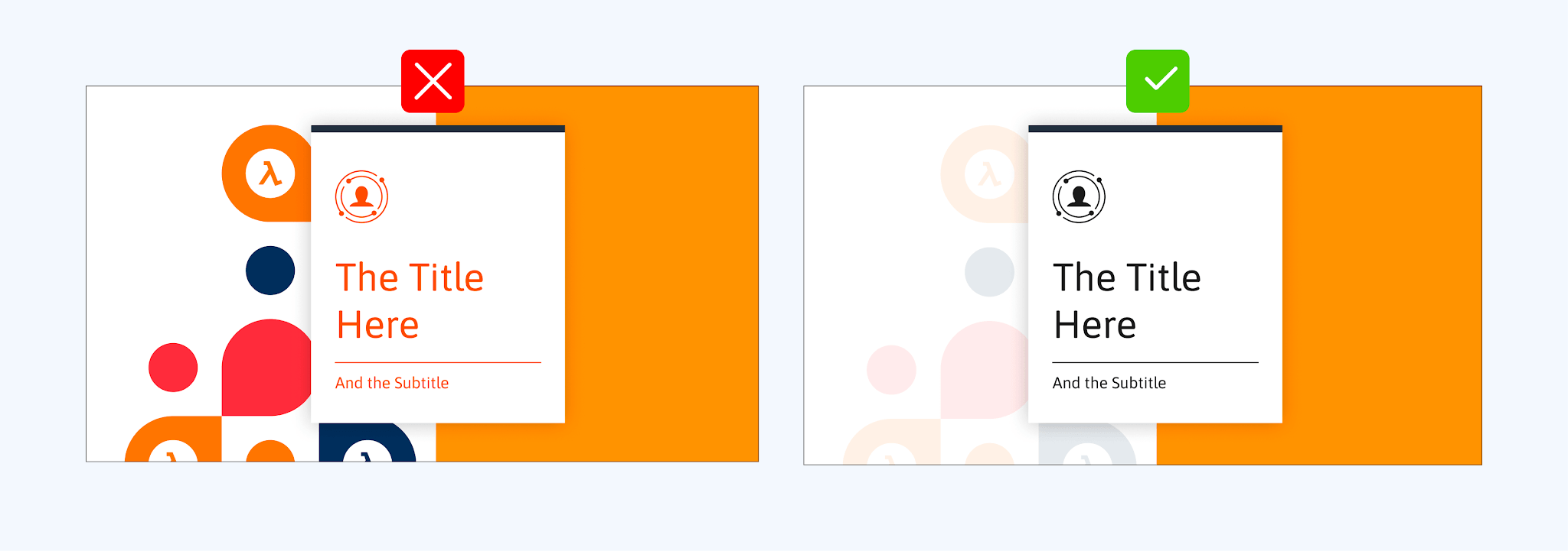
Colors evoke emotions and can guide the viewer's eyes. By contrasting colors, you can highlight specific areas of your design. Take, for example, that design on the left with its pop of colors. It pretty much yanks your eyes towards its pattern, making you kinda sidetracked before even getting to the title.
2. White/Negative Space
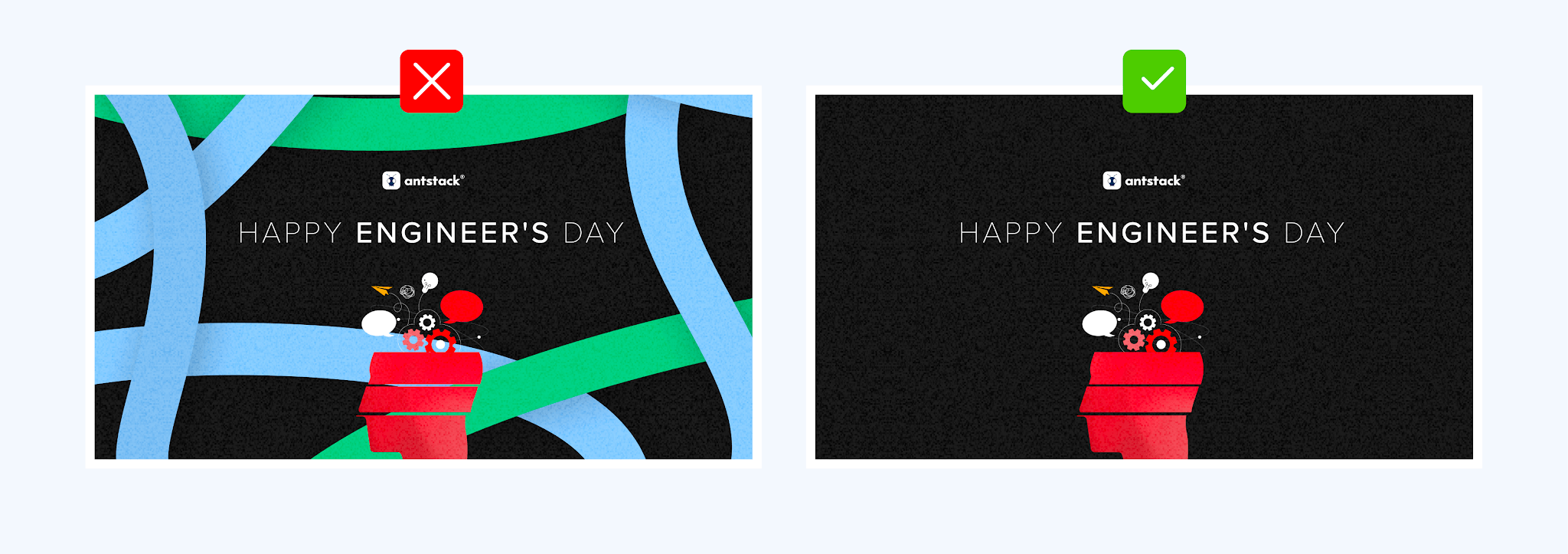
White space, or negative space, is not "wasted" space. It's a powerful tool that can bring clarity and focus to your design. By giving elements room to breathe, you emphasize their importance and guide the viewer's eyes.
3. Proximity
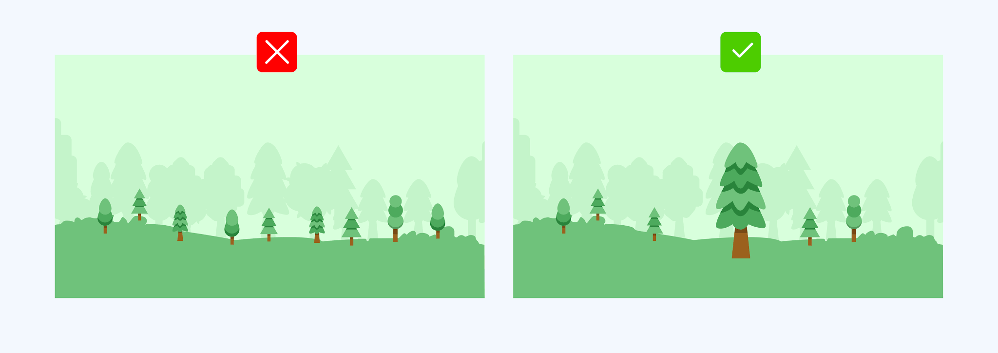
Bigger is often seen as more important. By playing with the size of elements – whether it's a heading, an image, or a button – you can indicate their significance in your design hierarchy.
"Fitts’ Law states that the bigger an object is and the closer it is to us, the easier it will be for us to reach it."
4. Typography
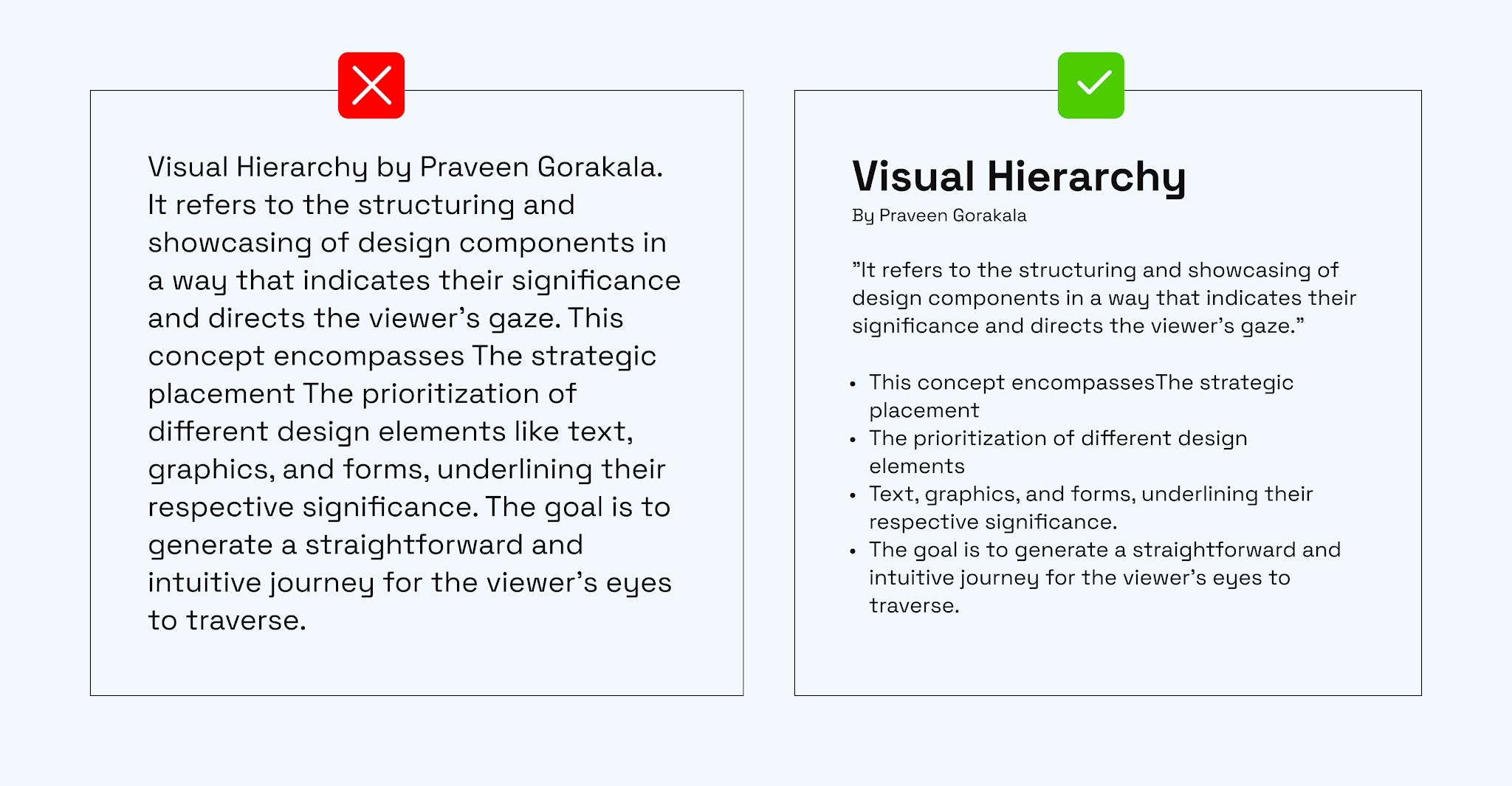
We're living in a world of quick peeks with shorts and reels, right? People wanna get the gist in a split second. Typography is a game changer here. Go bold and you grab 'em by the eyeballs. But use a chill, lightweight font and you're giving them the deets without the drama."
Conclusion
Design is a balancing act. While we strive for simplicity, we must also provide visual interest to keep our audience engaged. By leveraging the power of visual hierarchy, we can create designs that are not only aesthetically pleasing but also easy to navigate, ensuring our message is communicated effectively.